Apps, Dashboards & Data Stories

Portfolio

Apps, dashboards, and visualizations that turn data into clear stories, along with my work in AI, from podcasts to chatbots.

Scroll

Applications

College Sports Social Pulse website: Where rankings have a heartbeat
Python · Social Listening API

College Sports Social Pulse™

Sports Social Pulse™ is a University of South Carolina College of Information and Communications initiative that turns millions of social media conversations into actionable intelligence for media organizations, athletic departments, conferences, sponsors, and brands. I developed the software behind it for the USC Social Media Insights Lab, an app that ranks college sports teams, players, and coaches by virality.

The app pulls mentions, engagement, and sentiment from a social listening platform and combines them into a single virality score from 0 to 100. Schools are ranked within their own conference, while players and coaches are ranked across the league. The lab can adjust what gets tracked and how it is scored, and export results for further analysis.

By turning raw social data into clean, comparable rankings, the app gives the program's data science, sports business intelligence, and strategic storytelling a reliable foundation for uncovering the stories, trends, and fan behaviors driving the conversation around college sports.

Python · Data aggregation · OAuth 2.0 API integration · Entity resolution · Configurable analytics dashboards

See the reports here →
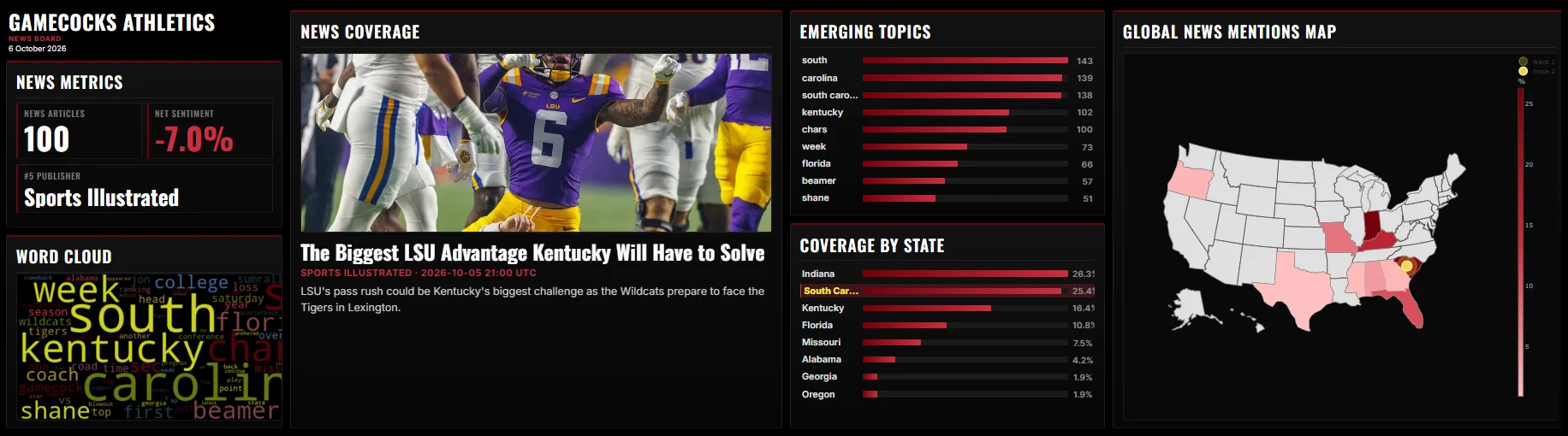
SMIL Board dashboard showing news metrics, word cloud, emerging topics, and coverage map
Streamlit · Plotly · VADER · NewsAPI

SMIL Board: Keyword News Tracker

A real-time news analytics dashboard that tracks media coverage of any topic. Keywords are set in an admin panel, and the app pulls matching articles from NewsAPI and FreeNews APIs, deduplicates records, and displays sentiment analysis, emerging topics, word clouds, and geographic coverage metrics. Everything is customizable through the admin panel.

Features include dynamic headline rotation, VADER sentiment scoring, and a toggle between country-level and US state-level coverage views powered by Plotly choropleth maps. Built for the USC Social Media Insights Lab with a digital-signage layout optimized for 3072×864 displays and full responsive support.

Python · Data aggregation · Real-time API integration · Multi-page Streamlit apps · Configurable analytics dashboards

View demo →
AI Chatbots

Experimental stimuli · XAI · Dissertation

Health Bot

For my dissertation, I built a health chatbot to test how explanation quality and emotional language shape users’ perceptions of AI health advice. It runs as a custom web app with OpenAI integration. Each reply is paired with a separate AI-generated explanation, and a researcher dashboard logs every conversation and links it to participants’ survey responses.

Every conversation follows a scripted flow rather than free chat. For each exchange, the model is instructed on what the reply must do, or the exact wording is fixed, so the content stays identical across experimental conditions. A settings page lets me adjust the model, prompts, tone, explanation style, and conversation length without touching code.

Explainable AI · Conversational design · LLM integration · Prompt design · Experimental research

Teaching · JOUR 312

AI Chatbot for Learning

In the course I teach, International Mass Communication (JOUR 312), students choose a country to research in detail, focusing on its laws, media culture, and regional or global influence. Before they start writing their papers, they interact with a chatbot specifically prompted to provide them with structured information about the country, along with possible theories they can integrate into their papers.

Experimental Stimuli · Mental Health

Chatbot as Experimental Stimuli

For an experiment with my advisor, Dr. Linwan Wu, I built a chatbot to test how design features shape users' perceptions and wellbeing. It runs on uChat and Chatwoot with OpenAI integration and gives users structured, supportive answers in real time.

Chatbot screenshots will be added once the paper is published.

Conversational design · OpenAI API integration · Prompt design · Experimental research

Coming soon

AI podcasts.

Data Visualization

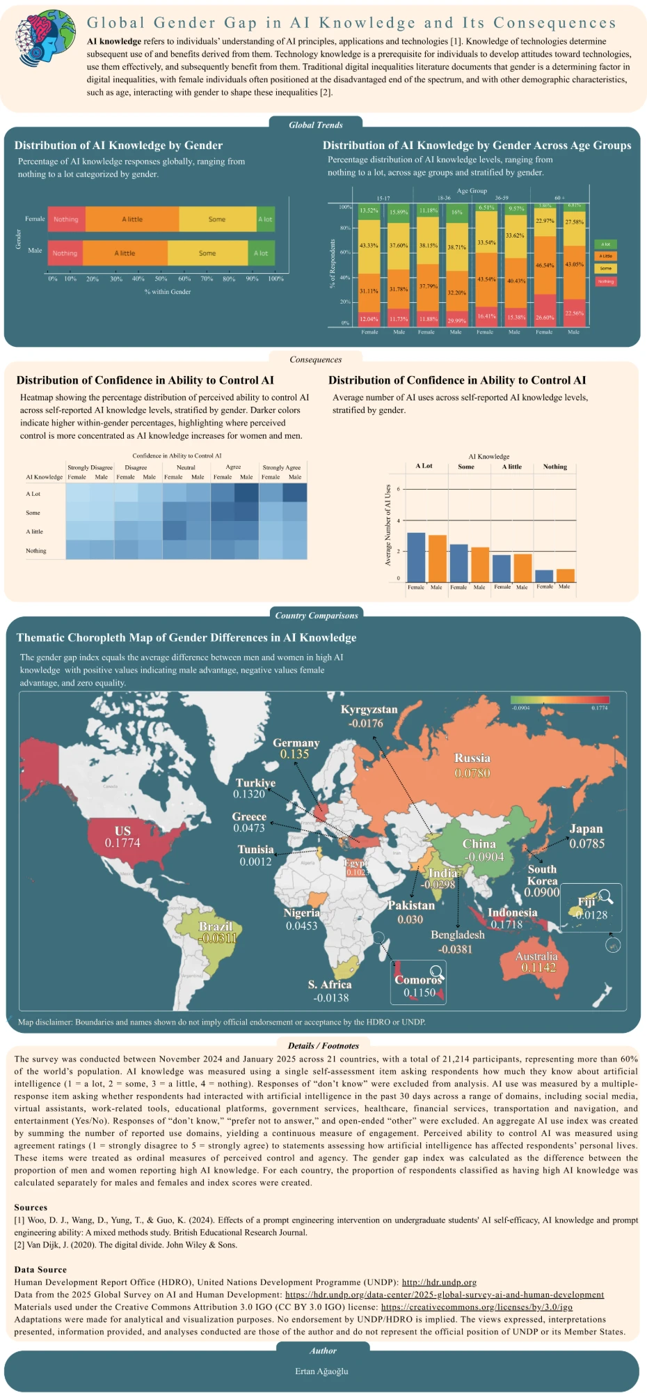
Infographic showing gender and age differences in AI knowledge across 21 countries, using stacked and grouped bar charts, a heatmap, and a world map.
First Place · University of South Carolina, University Libraries 2026 Data Visualization Awards

The AI Knowledge Divide: Gender, Age, and Digital Inequality

It shows gender differences in AI knowledge and how age interacts with gender to shape digital inequality. It draws on the 2025 Global Survey on AI and Human Development from the UNDP Human Development Reports, covering 21 countries. Because AI knowledge is measured on an ordinal scale, averages would be misleading and tables quickly become cluttered, so I designed the visuals to make the patterns clear to general audiences. This visualization won first place in the University of South Carolina, University Libraries 2026 Data Visualization Awards.

Design choices

  • Stacked bar charts show the full distribution of AI knowledge across gender and age groups, preserving the ordinal scale while keeping comparisons easy.
  • Grouped bar charts compare AI related outcomes across knowledge levels without relying on averages.
  • A heatmap shows confidence in controlling AI by knowledge level and gender, so viewers can spot where perceived control is strongest at a glance.
  • A choropleth map compares gender gaps across all 21 countries, where bar charts would be too dense to read.

Tableau · Canva · RStudio

View full visualization → Read the news →